Brand Guide
0.0.1 — Last Updated 23:38 13/12/2024
Accessibility
Accessibility is important so that our audience can clearly understand any information we share. Wherever text is written digitally there should be a text version available for screen readers.
This section will focus on contrast accessibility in digital formats when using text. This good practice for print too.
When applying text to a block colour from our colour palette (see below) text should always be white or navy-blue. If control of text colour is not available black should be used as a fallback.
White
HEX:
HSL:
RGB:
CMYK:
#FFFFFF
0, 0%, 100%
255, 255, 255
0, 0, 0, 0
Navy Blue
HEX:
HSL:
RGB:
CMYK:
Pantone:
#382A71
252, 46%, 30%
56, 42, 113
96, 100, 0, 100
2685
Black
HEX:
HSL:
RGB:
CMYK:
#000000
0, 0%, 0%
0, 0, 0
40, 40, 40, 100
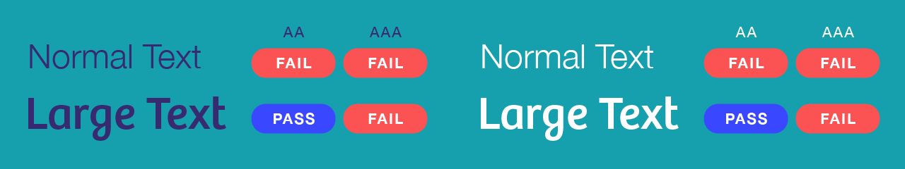
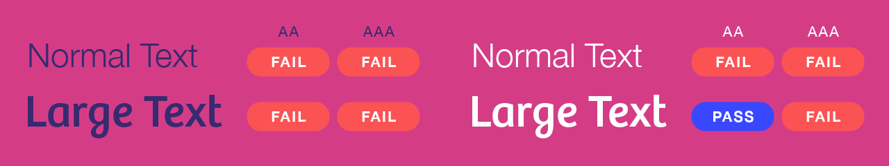
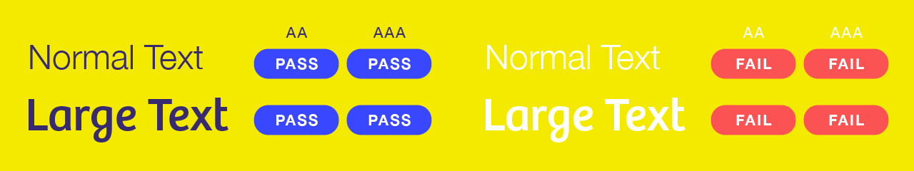
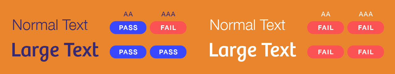
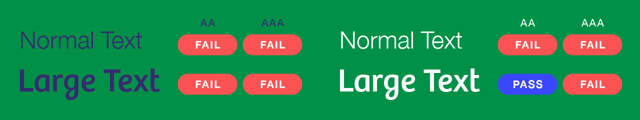
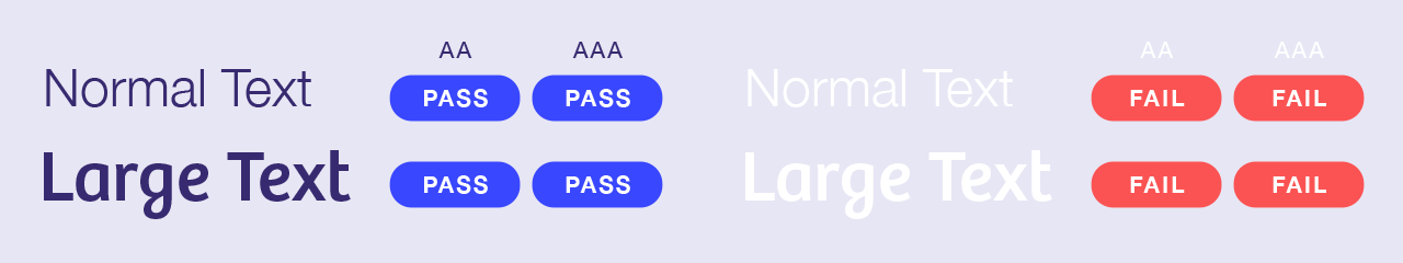
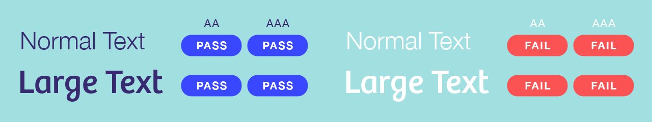
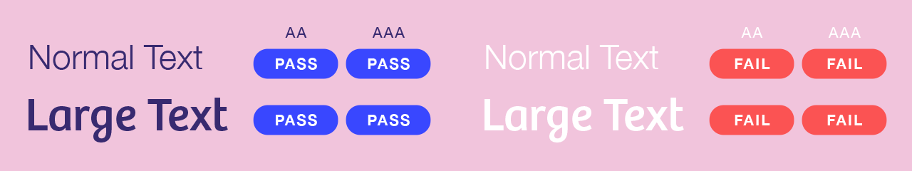
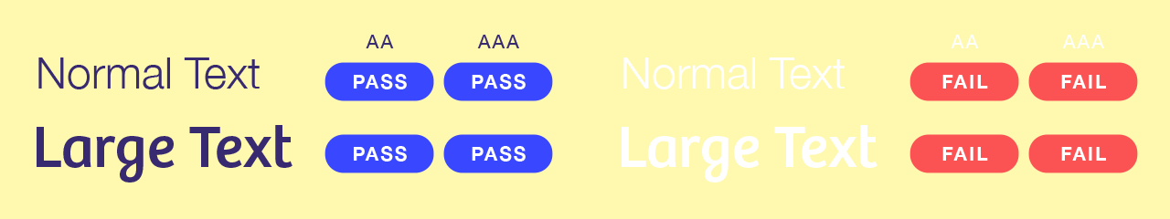
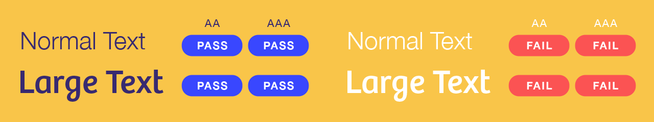
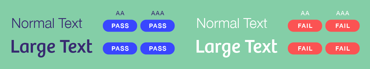
Contrast Colour Use
Contrast and colour use are vital to accessibility. People, including those with visual disabilities, must be able to perceive copy clearly. These results are to the WCGA AA standard and when ever possible AAA.They show how colour pairings can be used. Fails of AA should not be used, fails of AAA should only be used with due consideration. As you will see some colours should not be used as backgrounds for text.
All secondary colours can be used as a background for text, the text must always be in Navy-Blue.
Normal Text is main body copy text used for large blocks of text.
Large Text is display type and titles.
For more information on typography please refer to the previous page on fonts.


Secondary Palette

Fallback