Brand Guide
0.0.1 — Last Updated 00:02 14/12/2024
Typography
We use two typefaces, with a fallback that can be used in more restrictive environments.
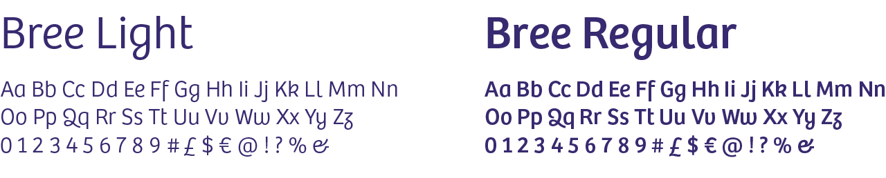
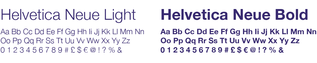
The main corporate types are Bree and Helvetica Neue, which both offer a range of weights and styles. The fallback is Arial. As Arial is a system font and accessible, we use Arial for email and website copy.
As our main typefaces are licenced, they can only be accessed directly from a brand ambassador or via the supplied links below. Arial is be accessible to everyone as it is a system font.
Please note that Bree and Helvetica Neue are not system fonts, you have to purchase them.
Beware: If you send an email or share a Word document using our corporate fonts (Bree and Helvetica Neue) to an external contact, the font will default to a different typeface. This is why we use Arial for email and Word documents. However it is fine to use our corporate fonts in PDF documents.
A note on alignment: Wherever possible please default to left-aligned text.
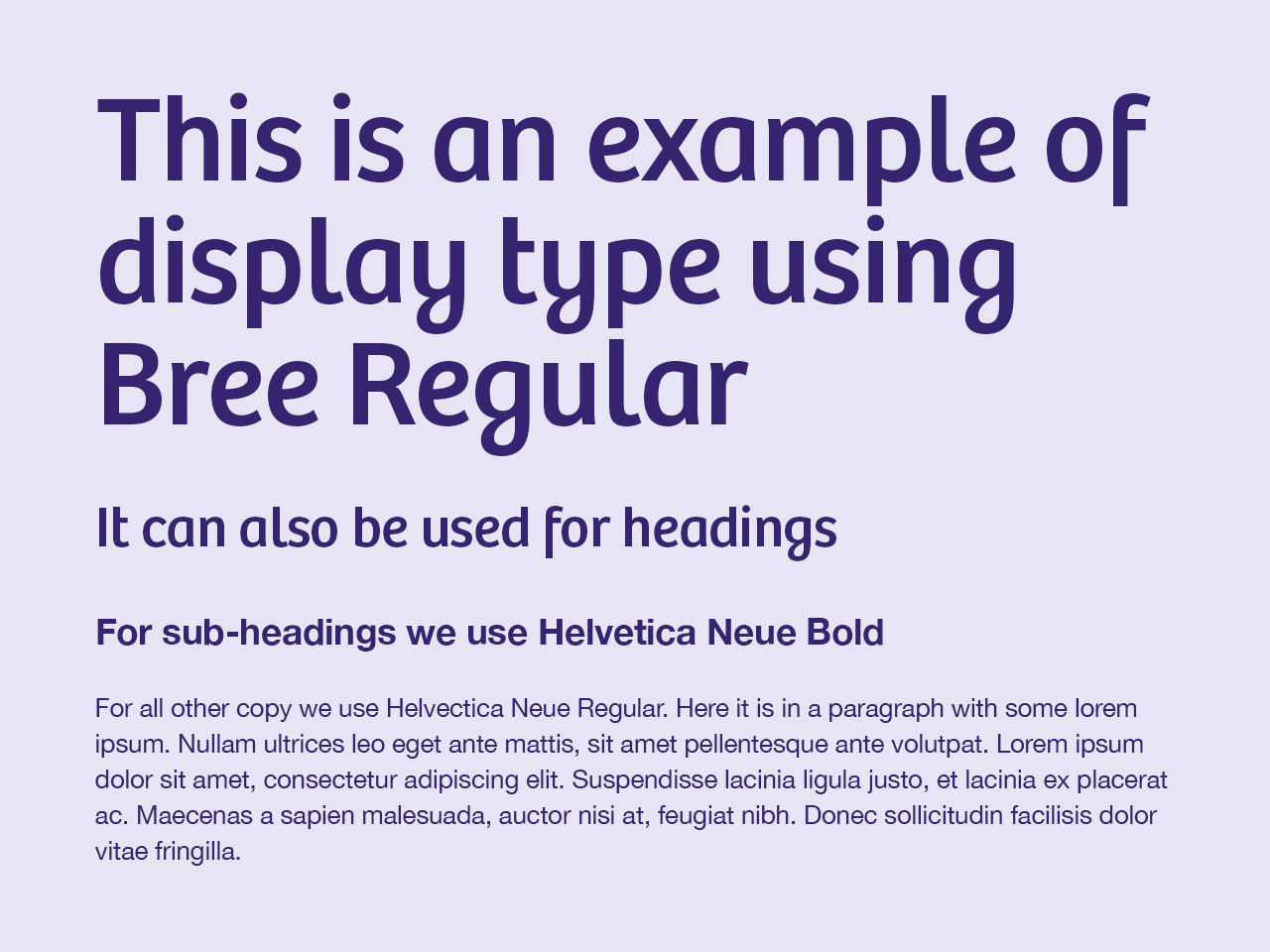
Display Font
Use Bree for display typography such as headings, subheadings and short introductory paragraphs. It should not be used for large blocks of text.
Main Font
Helvetica Neue should be used for all other text and text headings and should be left aligned. Justified or centred text should be avoided wherever possible.
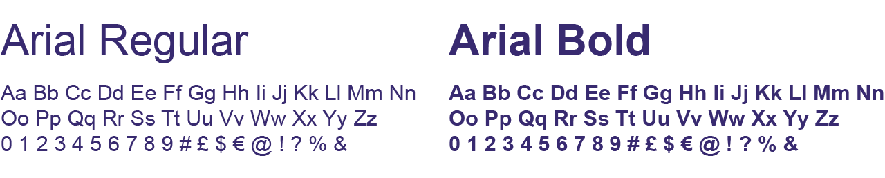
Fallback Font
Our fallback type is Arial. This should be used if you are unable to use the main typefaces in the software you're using - day-to-day uses include email, web text, Word documents and other Microsoft applications.