Brand Guide
0.0.1 — Last Updated 23:51 13/12/2024
Logo Clearspace
It’s important to allow logos room to breathe. Clearspace is the recommended minimum space given around the logo between itself and other other text or logos so that it's never overwhelmed.
More space is usually better, but too much can leave it feeling lost. So go with what looks good. These are our recommendations.
Our Logo Clearspace
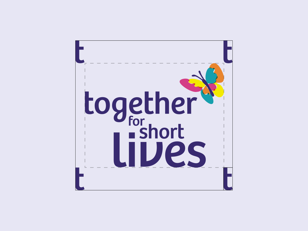
As a visual reference we recommend you use the t from the logo as minimum clear space around the logo. This is the absolute minimum and wherever possible we recommend giving the logo more room to breathe.

Main Logo Clearspace
Main Logo Clearspace - Use the letter 't' as a reference. This is 22% of with weight and 9% of the height.