Brand Guide
0.0.1 — Last Updated 23:58 13/12/2024
Logo Don'ts
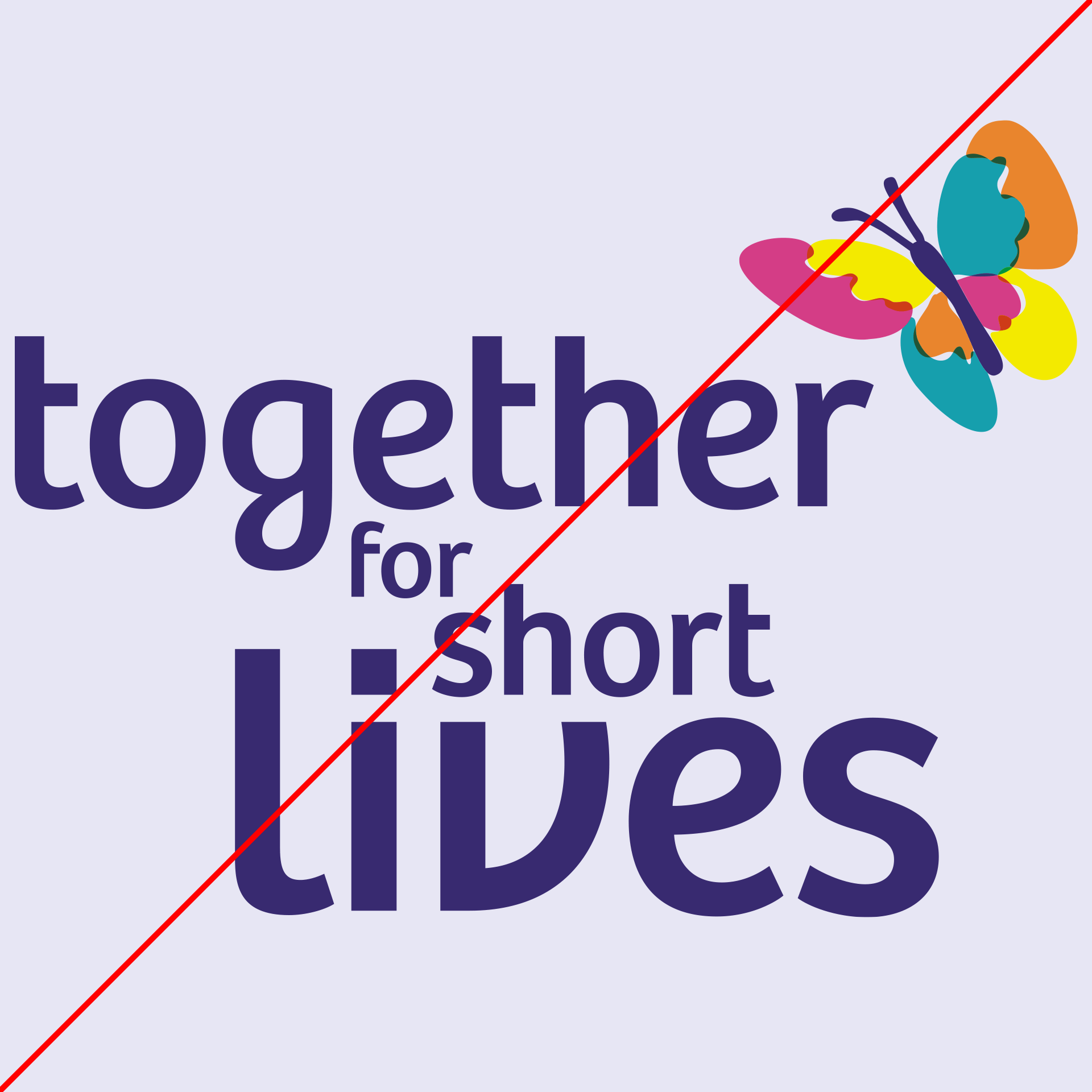
The logo should never be altered from its supplied form. While we can't list all the don’ts, these are some of the common mistakes people will make when misusing the logo. As you can see, they don’t look great.
A general rule of thumb is that if it doesn’t look right, it probably isn’t. Always refer to the guide or speak to a designer or brand ambassador.
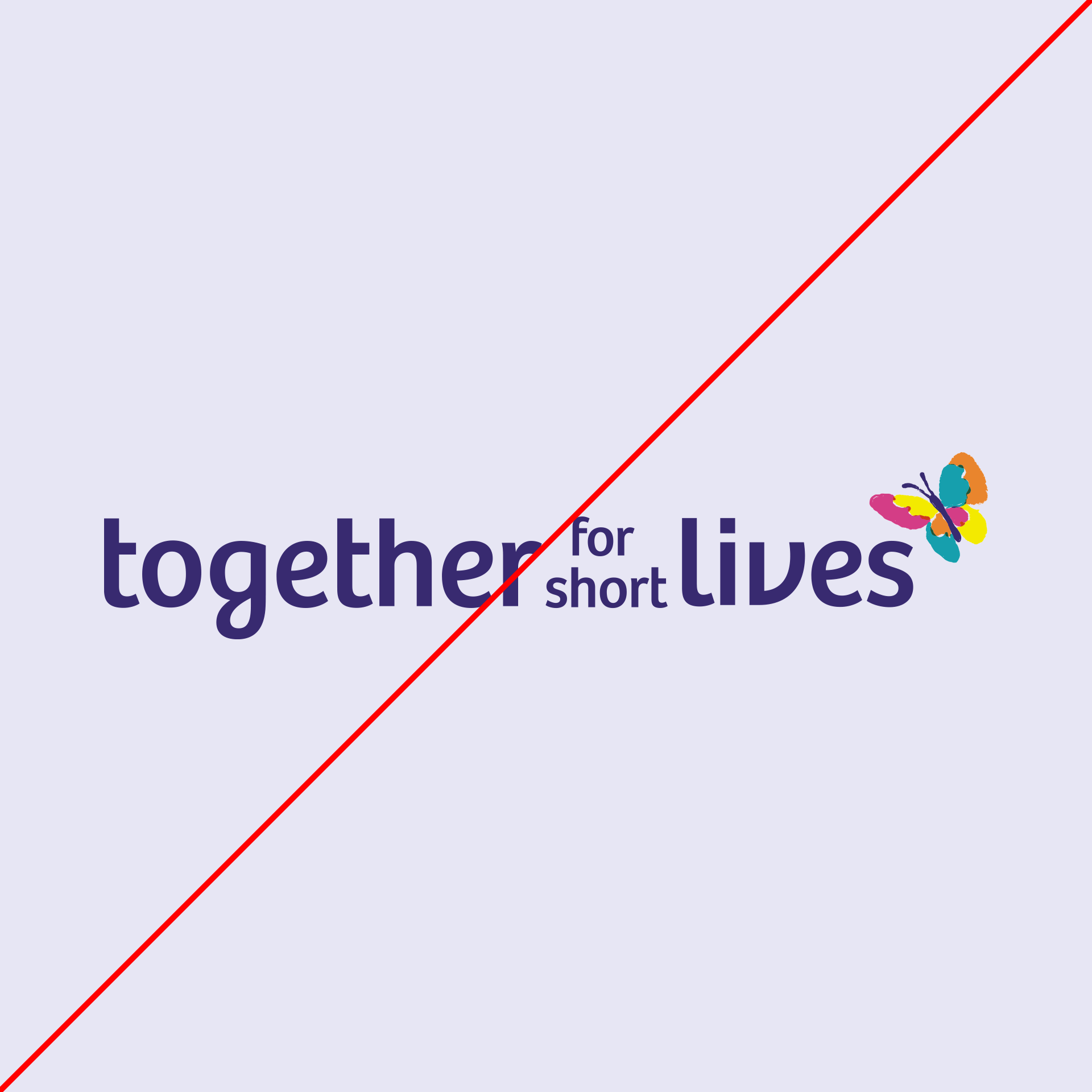
Do not alter the logo in any way, such as removing elements or changing its layout.

Be aware of contrast. Use the appropriate version of the logo against its background as recommended in the colour use section. If you are unsure of contrast issues, use a contrast colour checker.
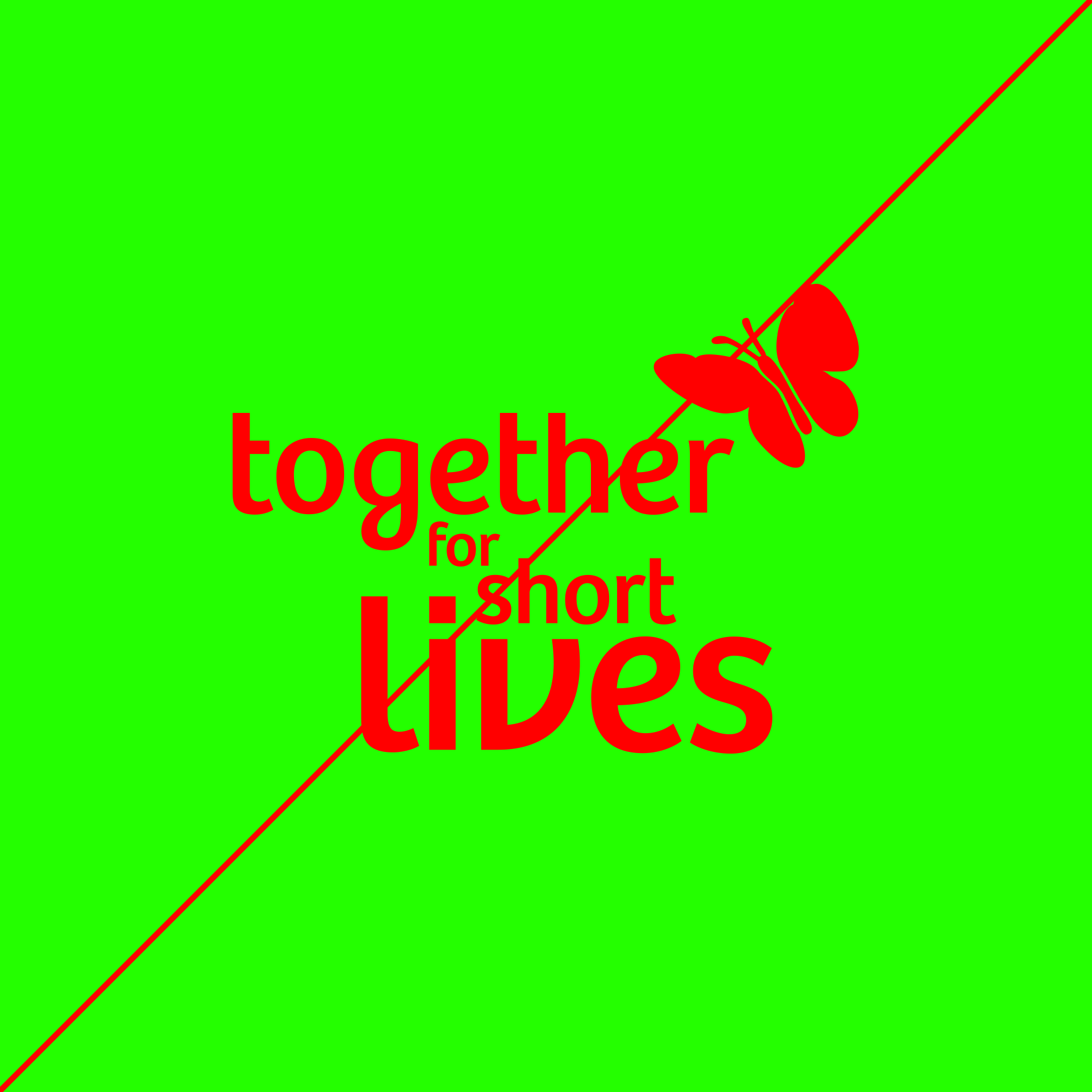
Do not use non-brand colours. If using third-party colours, be respectful of our brand.
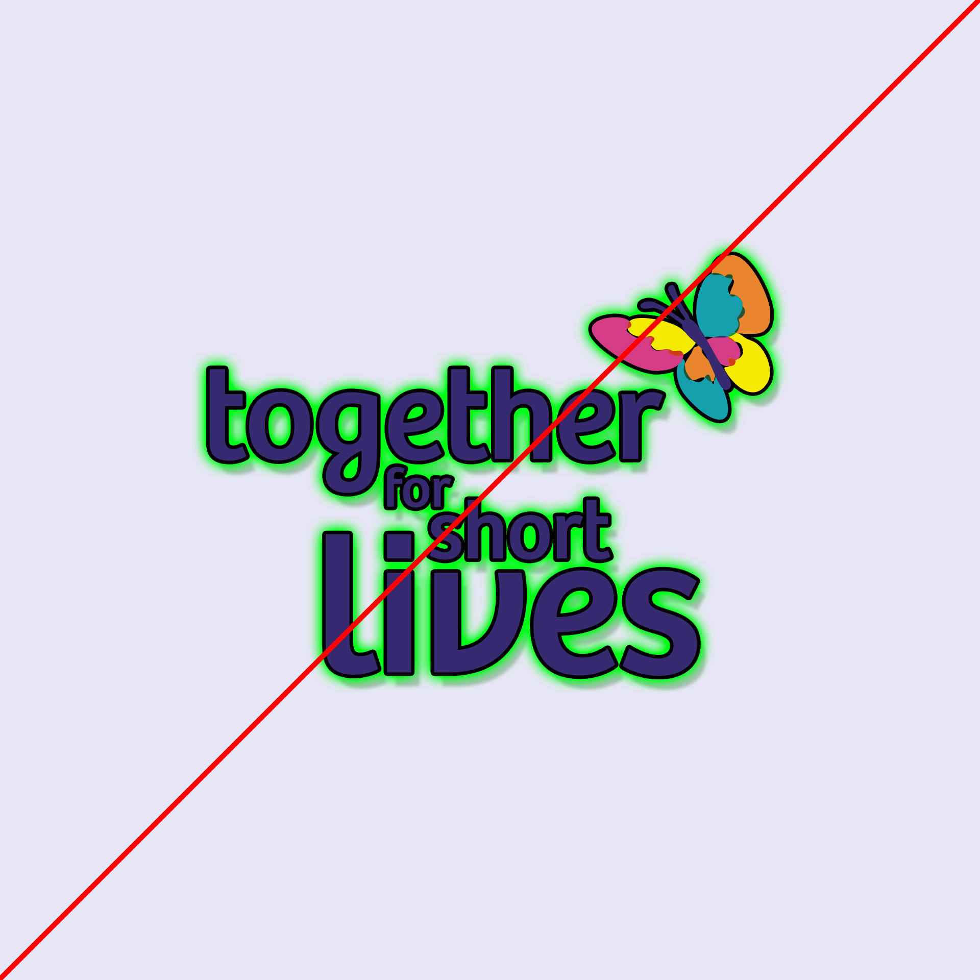
Do not stylise the logo, such as adding borders (strokes), drop shadows or glows, etc.
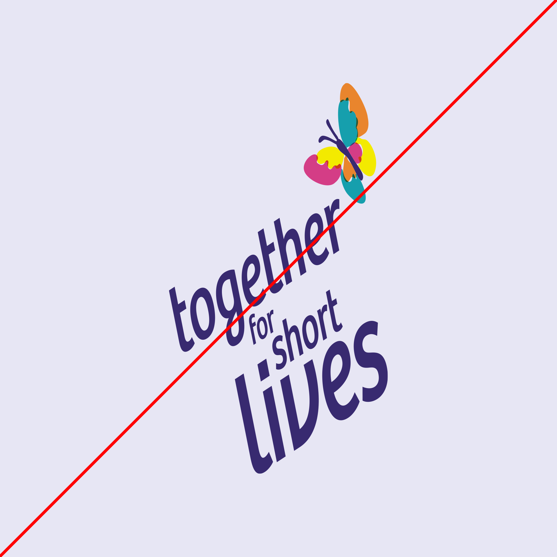
Do not alter the logo's proportions by stretching, squashing, skewing, shearing or rotating it.
Respect the clear space guidelines. Use the appropriate logo in the relevant space and allow the logo room to breathe.

Do not use non-brand colours with the logos.
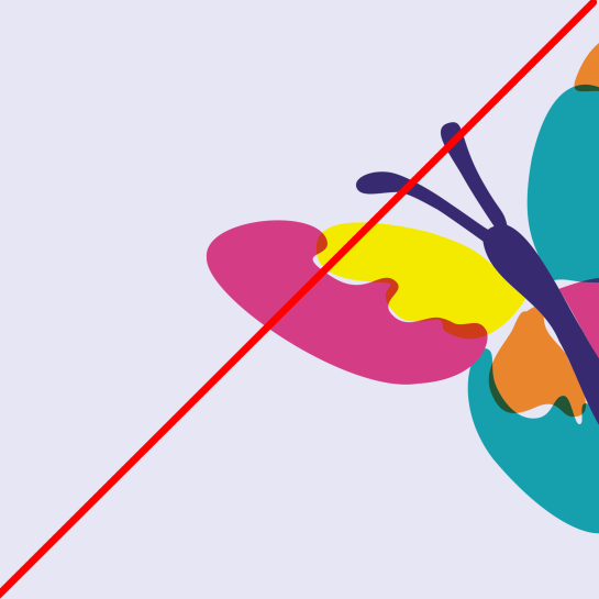
Do not crop the butterfly or main logo off the side of a frame unless you have had explicit permission from the Communications team at Together for Short Lives.