Brand Guide
0.0.1 — Last Updated 21:07 13/12/2024
Butterfly Trail
The butterfly trail is always used in conjunction with the butterfly icon, either the original or digital version. The trail colour should only ever be the navy-blue or white from the primary palette. The navy-blue should only be used over white or light backgrounds and the white should only be used over navy-blue or a dark image and is recommended for use over photography.
Trail Pack

Rules
The butterfly should always be facing left.
The trail should always be flowing right to left.
The line is always a dashed line with thickness to gap ratio of 1:3 — for example: a 2pt thick stroke should have dash length and gaps of 6pt.
Don'ts

The trail should not be in contact with the butterfly. Always leave a small gap.

Do not flip or rotate the butterfly and trail.
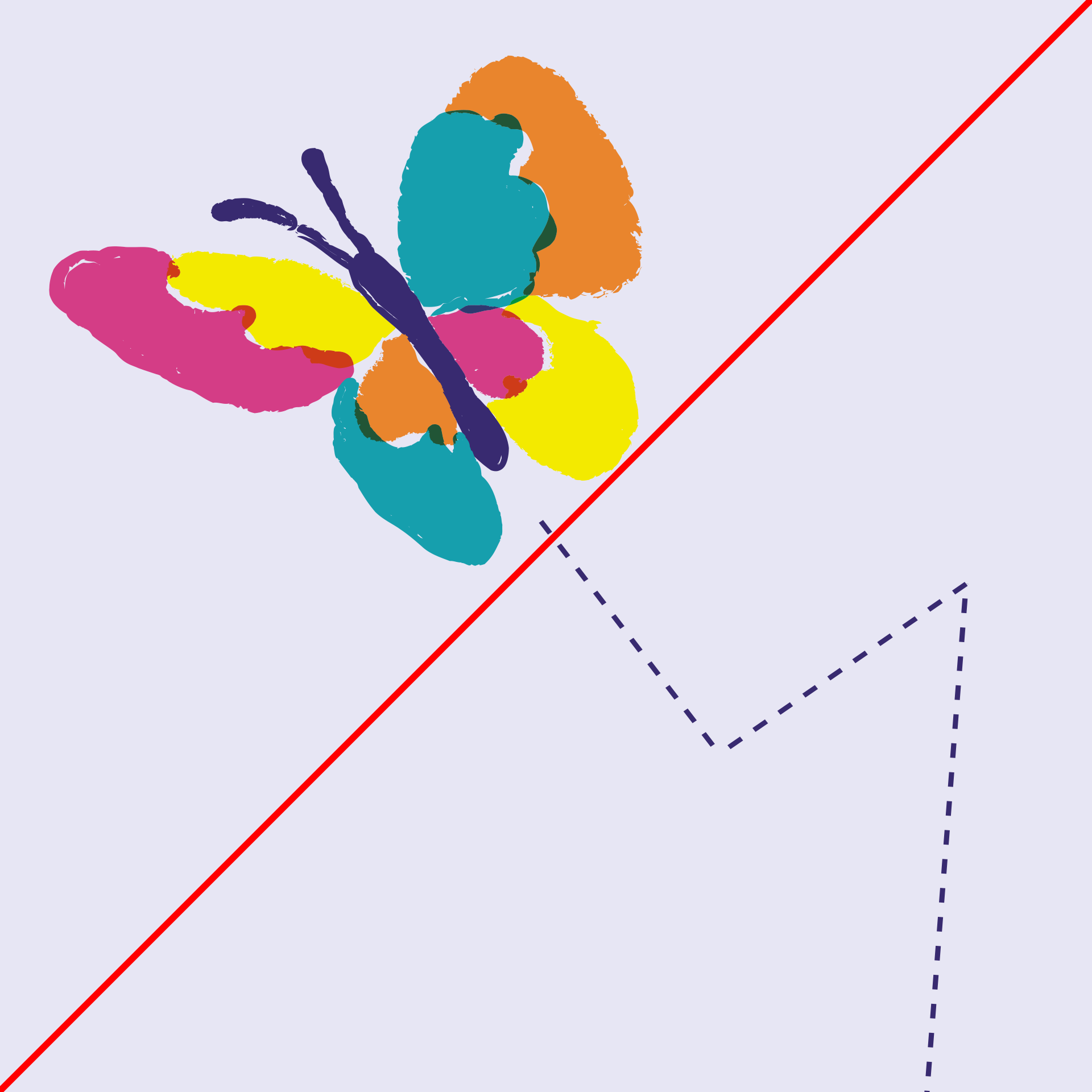
Do not use zigzag's for the trail, they should always be smooth flowing curves.
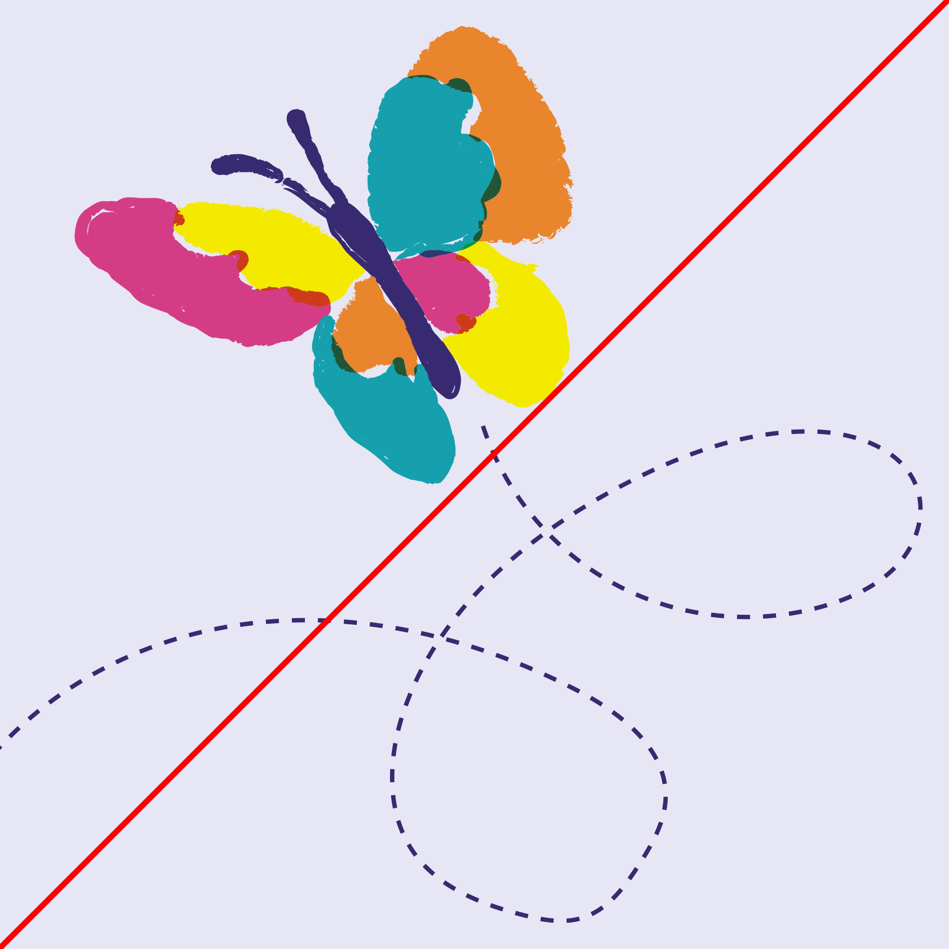
Do not add loops to the trail. This represents confusion.

Do not use non-brand colours for the trail.